
Does a Good Return Policy Increase Conversions? Only If Shoppers Find It in Time
If you have already made your return policy generous and conversion did not move, you are not imagining it. Generosity and reachability are two different variables, and only one of them is usually the constraint.
The short answer
Yes — a good return policy increases conversions. But the mechanism is not the one most operators buy. It runs through whether a hesitating shopper can confirm, in the moment of deciding, that these specific terms cover her specific situation. Terms she cannot find in time are not a conversion lever. They are a line item in your legal documentation that happens to also be a nice thing to offer the customers who eventually need it.
The evidence for the mismatch is unusually clean. Baymard’s product page UX benchmark finds that 60% of shoppers look for return information on the product page (from a quantitative study of 1,032 respondents), while 44% of sites do not display or link the return policy from the main product page content. And in Baymard’s checkout abandonment research, an inadequate returns policy is cited in 13% of abandonments — with “inadequate” being the shopper’s judgement, not an audit of your terms. A policy nobody can locate at the decision point reads as inadequate whether or not it is.
Two variables that keep getting treated as one
Improving your terms and improving their reach are separate projects with different costs.
Generosity — free shipping both ways, a longer window, waived restocking fees — is a permanent margin decision. It is also the one every competitor benchmark pushes you toward, which is why so many brands have already made it and are now looking at flat conversion wondering what went wrong.
Reachability is a layout decision plus an answer layer. It costs almost nothing by comparison, and it is where the gap usually is. A 60-day free-returns policy that is accurate, fair and competitively benchmarked still does nothing for a shopper who cannot find it in one move, or who finds it and cannot tell whether an exchange rather than a refund, or a gift rather than a personal purchase, falls under the general language.
Brands that respond to soft conversion by improving terms alone are usually optimizing the variable that was never binding.
The second decision nobody instruments
A shopper on a considered purchase makes two decisions, not one.
The first is do I want this, and your product photography, copy and reviews are built to win it. The second arrives after add-to-cart and sounds like what happens if I am wrong about wanting this. Nothing on a standard product page is built to win the second one.
It surfaces late, which is precisely why it is hard to see. Everything about the session up to that point looks like a converting visitor. There is no earlier drop-off to investigate. In session recordings the shape is recognizable — add to cart, tab switch (often to search your own return policy from outside your site), no return to checkout. In your funnel report it is one more unit in the abandonment bucket, indistinguishable from a shopper who got distracted by a notification.
Most analytics setups track add-to-cart, checkout-started and purchase-completed, with nothing in between to record why a session stalled between the first two. That is not a tooling failure so much as a structural one: the reason lives in a question the shopper never got to ask. This is the same blind spot that makes ordinary cart abandonment analysis so frustrating — the aggregate number is real and the causes underneath it are not separable without looking at session-level behaviour.
What return anxiety is actually made of
Three concerns, weighted differently by what you sell:
- Cost. Free return shipping, paid return shipping, or a restocking fee that turns a wrong guess into a loss.
- Hassle. Printing a label, finding the original box, getting to a drop-off point, waiting in a queue.
- Certainty. Whether the refund or exchange will actually be issued, and how fast — usually imported from a bad experience at some other retailer rather than anything about you.
None of the three is answered by a product description, and none is answered by a review. Reviews establish that the product is good; they do not establish what happens when it is not right for this particular buyer. That is a second layer of trust entirely, and it is answered — if it is answered at all — by a document most shoppers do not open until the hesitation is already loud enough to stop checkout.
Which categories carry it
Low-price, low-stakes, non-fitted goods barely show the effect. Consumables and small accessories are cheap enough to guess on; shoppers do not read terms before buying them.
The effect concentrates in everything else: sized, fitted, matched to an existing set, or bought for someone else. Apparel and footwear, furniture, fine jewellery and watches, gifting across all of them. Footwear is the extreme case — return rates there run higher than any other fashion category, and the anxiety is proportional to the rate the shopper suspects she is walking into.
That distribution has a useful implication: the categories where return anxiety costs the most are the categories where a considered-purchase brand makes its margin. This is not a long-tail optimization. It sits on your best pages.
Why a better policy page does not close it
Because the shopper’s question is specific and a policy page is general, and no amount of expanding the page fixes the mismatch.
A FAQ or an extended returns page is written once, for an average shopper, and requires the visitor to search it and then self-interpret whether her case is covered. But shoppers almost never phrase their real concern in the language of a policy document. “I’m buying this as a gift and I’m not sure of her size” is not the same question as “what is your return window,” even when one policy technically answers both. The shopper does not know the two are the same question. That translation is work, and she is doing it while deciding whether to spend $600.
There is also a half a static page structurally cannot do: reduce the odds a return happens at all. A shopper worried about sizing does not primarily want to know what happens if she guesses wrong — she would rather not guess wrong. Reassurance and prevention are different jobs, and a page can only ever do the first.
What closes it: an answer at the decision point
The fix is not a rewritten policy. It is a live answer layer on the pages where the anxiety concentrates — something that can take the question in the shopper’s own words and answer it before the tab closes.
For us that runs across three modules, and which one carries the weight depends on the question:
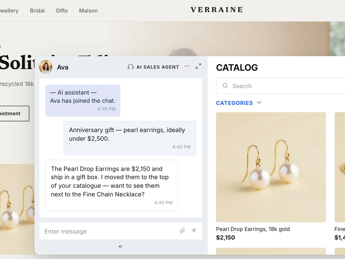
- AI Sales Agent handles the volume case on the product page: the direct return, exchange and delivery-window questions, in the shopper’s own phrasing, at whatever hour she is deciding. This is where most return anxiety gets resolved, because most of it is one specific question away from resolution.
- Clienteling — 1:1 live co-shopping and outbound — handles the case where reassurance is not enough and the shopper needs someone to look at the piece with her. On a $600 pair of boots or a $4,000 ring, “will this fit my instep” and “is this the right piece for her” are conversations, not lookups.
- Video Commerce — shoppable video, live events, video on the PDP — closes the resolution gap that creates the wrong-guess risk in the first place: scale, movement, weight, how a stone actually reads in daylight.
The through-line is human, personal, measurable. Human, because the anxiety is about being left alone with a mistake, and a person on the other end is the direct answer to that. Personal, because the general policy is already public and the thing she cannot get anywhere else is whether it applies to her. Measurable, because assisted conversations tie to orders and to exchanges-versus-refunds — a returns programme you cannot attribute is one you cannot defend when someone asks whether it paid for itself.
The prevention half
The strongest version of this does both jobs in one interaction: the reassurance (“exchanges are free and turn around in three days”) and the actual help (“this style runs narrow — for your usual size, take the wide”).
That second half is what separates an answer layer from a better-worded policy. It lowers the return rate rather than merely tolerating it — and on high-consideration goods, a return that gets converted into an exchange is worth more than a return prevented by friction, because the shopper ends the exchange with the right item and a reason to come back.
A six-step audit you can run this week
- Time the distance from product page to return terms. Count the clicks and scrolling it takes a first-time visitor to reach a clear statement of your terms starting from a product page. More than one move and most hesitating shoppers will not make the trip.
- Check whether your terms are on the page at all. Baymard’s 44% is a benchmark, not an excuse — verify which side of it you are on, on your highest-consideration templates specifically.
- Audit session recordings for the add-to-cart-then-vanish pattern. Look for tab switches shortly after add-to-cart with no return to checkout. That shape is distinct from ordinary browsing abandonment and it is the one worth counting.
- Read your support and chat history for pre-purchase return questions. These are shoppers motivated enough to ask out loud. Their phrasing tells you which of the three concerns — cost, hassle, certainty — dominates for your catalogue, and the phrasing itself is what your answer layer needs to recognize.
- Rank your categories by anxiety, not by traffic. Sizing-dependent, gift-oriented and high-consideration lines first. That is where an answer layer earns its keep, and it is a smaller surface than “the whole site.”
- Put the answer layer where the decision happens. Not a better policy page. The terms may already be competitive; the missing piece is reaching a hesitating shopper with the specific version of them, on the page, in the moment.
What to measure
Not policy page views. That metric rises when your policy is hard to find, which makes it exactly backwards as a success signal.
Track four things instead: how many pre-purchase return questions get answered on the page; whether shoppers who ask one convert differently from those who do not; your ratio of exchanges to refunds; and whether pre-purchase contacts into your support queue fall as the on-page layer absorbs them. Those four move together when the gap is genuinely closing, and they are attributable — which matters when you are asked to justify the programme rather than describe it.
Resist borrowing an uplift figure from a vendor case study and treating it as your own forecast. Category mix, average order value, how generous your policy already is and how motivated your traffic already is all shift the result store to store. The audit above is built to produce your number rather than assume someone else’s.
Where to start
Run one comparison. Time how long it takes a first-time visitor to find and confirm your return terms from a product page, then compare that against how long a hesitating shopper actually stays before closing the tab. If the first number is larger than the second, that gap is costing you orders right now — independent of how good your terms are.
Reviews, trust badges and product copy all keep doing their jobs in this framework; none of them go away. Return anxiety is a separate, later concern with a separate fix: not more proof that the product is good, but a direct answer to what happens if it turns out not to be right. Most brands already have terms generous enough to answer that well. The gap is almost always in whether the answer arrives in time.
If you want to see what that looks like against your own catalogue and your own traffic rather than a demo dataset, our entry point is a conversation, and for a real programme we run a 60-day pilot, on us. What it costs depends on your traffic and which modules you run — the current bands are on our pricing page.
Frequently asked questions
Yes, but the effect runs through visibility and specificity far more than through generosity. A free-returns, long-window policy sitting behind a footer link does very little for a shopper who never scrolls down to find it, and nothing at all for a shopper who finds it and still cannot tell whether an exchange, or a gift purchase, or a second size ordered alongside the first is actually covered by the general language. Baymard's testing puts numbers on the mismatch: 60% of shoppers look for return information on the product page, and 44% of sites do not display or link it there. A mediocre policy stated clearly at the point of decision routinely outperforms a generous one that is hard to reach.
Because wanting the item and being comfortable with the downside are two separate decisions, and the second one comes later. A shopper who has already decided she likes the product pauses on a different question — not "do I want this" but "what happens if I am wrong about wanting this." In session recordings the pattern is distinctive: add to cart, tab switch, no return to checkout. In aggregate reporting it is invisible, because it looks exactly like price sensitivity or casual browsing. Baymard's abandonment research finds an inadequate returns policy cited in 13% of checkout abandonments.
Three concerns, weighted differently by category. Cost — will this cost money to send back, through return shipping or a restocking fee. Hassle — printing a label, finding a box, getting to a drop-off. And certainty — will the refund or exchange actually be issued, and how quickly, a worry usually carried over from a bad experience at a different retailer rather than anything about your store. None of the three is answered by a product description or a review. They are answered, if at all, by a policy page most shoppers do not open until the hesitation is already strong enough to interrupt checkout.
Low-price, low-stakes, non-fitted goods barely show the effect: the downside of guessing wrong is small enough that shoppers do not check the terms first. Anything sized, fitted, matched to something already owned, or bought as a gift shows it strongly, because the cost of a wrong guess is real and the shopper has a specific, personal version of the question. Apparel and footwear, furniture, fine jewellery and watches, and gifted items are where the gap is widest — which is to say, exactly the categories a considered-purchase brand sells.
Both matter and neither substitutes for the other, but most brands have far more room on communication than on generosity. Free returns, longer windows and waived restocking fees all carry a permanent margin cost; making the existing terms reachable and specific at the decision point costs a layout decision and an answer layer. Before you buy the margin, check whether your current, probably already competitive policy is reaching hesitating shoppers at the moment they need it. Most operators who look find the terms were never the constraint.
A FAQ is static and general — written once, for an average shopper, leaving the visitor to search it and then decide for herself whether her situation is covered. Shoppers rarely phrase their real concern in the language a policy document uses. "I'm buying this as a gift and I'm not sure of her size" is a different question from "what is your return window," even when one policy technically answers both. A responsive layer takes the question as asked and answers that. It can also do the half a page structurally cannot: reduce the odds the return is needed at all.
Look for the add-to-cart-then-vanish pattern specifically rather than the overall abandonment rate, which conflates too many causes to be useful here. Cross-reference it against the categories where fit, sizing or gifting uncertainty is highest. If your most fit-dependent, highest-consideration products abandon worse than your simple ones despite comparable review quality and traffic quality, return anxiety is a reasonable hypothesis — and a testable one: put a live answer layer on those pages first and compare.
Policy page traffic tells you people went looking. It does not tell you whether they found what they needed, and it rises when the policy is hard to find — the opposite of what you want. Track the pre-purchase return questions actually answered on the product page, whether shoppers who get one convert differently from those who do not, the ratio of exchanges to refunds, and whether pre-purchase contacts to your support queue fall as the on-page layer absorbs them. Those four move together when the gap is genuinely closing.