

How to Build Trust in Your Online Store Beyond Reviews
If your reviews look good and conversion still lags, you are not imagining it. Reviews close one layer of trust and leave a second one untouched — and on a considered purchase, the second layer is where the sale is decided.
The short answer
Trust in an online store is not one thing. It has a coarse layer — is this real, does it work, will this seller take my money and disappear — and a fine layer — will this work for me, specifically, right now.
Reviews, badges, policies and a clean checkout are excellent at the coarse layer. They are structurally incapable of touching the fine one, because everything they say was written before this visit, for an average shopper, by someone whose situation is not this shopper’s situation.
The fine layer needs something responsive: a person, or an agent, that can take the actual question in front of the actual shopper and answer it while she is still on the page. That is the whole move. Everything below is how to tell whether that gap is what is costing you, and what to put in it.
What every trust guide tells you to do
Read the current crop — Simple Global, SimTech, Iconic, OptiMonk, Burst — and the list is remarkably consistent:
- a professional, consistent site design;
- customer reviews and ratings displayed prominently;
- SSL, security seals and familiar payment methods at checkout;
- transparent shipping, returns and privacy policies;
- a real address, a phone number, a contact page;
- a fast, low-friction checkout.
None of it is wrong. All of it is worth doing, most of it is cheap, and a store missing these items has a genuine problem. But notice what the entire list has in common: every item is static, generic and written in advance. It is the same design, the same badge, the same policy and the same review pile for every visitor, whatever she came to ask.
That works when the only question is “can I trust this shop.” It stops working the moment the question becomes “is this the right one for me.”
Two layers of trust, and only one of them has a widget
| Coarse trust | Personal trust | |
|---|---|---|
| The question | ”Is this real and does it work?" | "Will this work for me?” |
| Evidence type | Aggregate — many people, generalized | Individual — this situation, now |
| When it was created | Before this visit | During this visit |
| Who it was written for | The average case | This shopper |
| What supplies it | Reviews, badges, policies, design | A responsive human or agent |
| What it costs to add | Low, one-time | Staffing and process — which is why it is rare |
Almost the whole trust-signal industry lives in the left column, because the left column can be shipped as a widget. The right column cannot, and that is precisely why it is where the advantage sits: your competitor can install the same review app you did this afternoon. They cannot install the person who knows the product.
Why cart abandonment survives a 4.6-star rating
Abandonment on a well-reviewed product page is rarely a verdict on the product. It is an unresolved detail — she is between sizes, she is not sure it works with the one she already owns, she cannot tell from four photographs whether the finish is what she wants. She has one question, no way to ask it, and a tab she can close in less time than an email takes to write.
This is also why discount-led recovery under-delivers on considered purchases. An exit-intent coupon changes the price. It does not answer the sizing question. Some of that traffic converts anyway — price is enough of an incentive to take the gamble — but the shopper who genuinely could not tell whether the piece would work for her is just as unsure at ten percent off. Price tactics treat the symptom; the blocker is still there for the next purchase, and for the one after that. We have written about what actually recovers a high-ticket cart separately, and the shape of the answer is the same: certainty, not discount.
Why more reviews don’t close it
Volume and specificity are different axes, and more reviews only move volume.
If a shopper’s blocker is a specific fit or compatibility question, sixty reviews resolve it no better than forty did. More instances of generic, aggregate testimony do not average into an answer for one individual case — they just make the aggregate more confident about something she was not asking. Stores that respond to soft conversion by requesting more reviews, incentivizing photo reviews, or moving the review-request email earlier are optimizing a number that was never the constraint.
The tell is easy to check: if your rating is strong, your review count is growing, and conversion is flat, the problem is not on that axis at all.
The questions reviews structurally cannot answer
They share a shape — conditional, personal, addressed to a situation the shopper can describe and a stranger’s review could never anticipate:
- Fit. “I’m between sizes — which way do I go on this last?”
- Compatibility. “Will this work with the one I already have?”
- Use case. “I need it for this specific thing. Does it hold up?”
- Edge cases. Care, materials, ageing, servicing — everything the description did not think to cover.
Your support inbox is already full of exactly these, submitted by the small fraction of visitors motivated enough to write and then wait a day for an answer. That fraction is the visible tip. The much larger group does not write. They leave, and the leaving does not appear in any report you currently run.
In footwear, we found the same shape when we looked at why returns cluster around fit rather than size: the shopper is not confused about the number on the box, she is uncertain about how it will actually sit — and that is a question only a person who knows the last can settle. In fashion more broadly, the size-and-fit gap on the product page does the same work before the order is ever placed.
What actually closes it: a live answer layer
The requirement is narrow and specific. The layer has to be on the page, not in an inbox she has to seek out. It has to be responsive, not another accordion of pre-written text for her to search. And it has to be accountable — the answer has to come from something that actually knows the catalogue.
A FAQ block is not this. An expanded size chart is not this. Both are still the average case, presented more thoroughly.
At Immerss this is three connected modules rather than one widget, because the same question arrives at different levels of consideration:
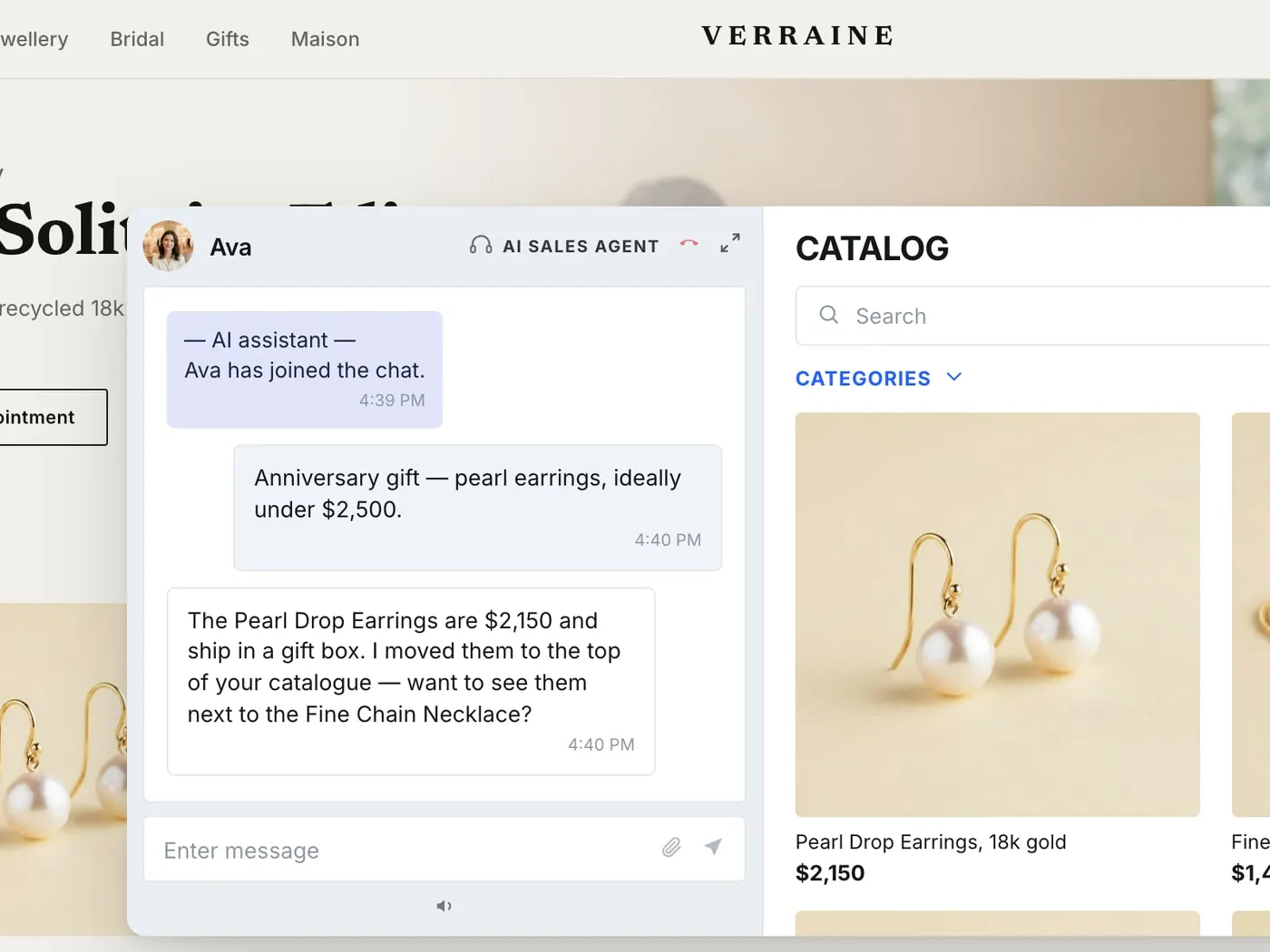
- AI Sales Agent — always on, on the product page, taking the shopper’s actual question in her own words, working from your catalogue rather than a canned intent tree. It handles the volume of fit, compatibility and use-case questions that never justified a human, and it qualifies the ones that do.
- Clienteling — one-to-one live co-shopping and outbound, where an associate takes the conversation on video with the client’s history in front of them. This is the layer for the piece that is genuinely being decided rather than merely browsed.
- Video Commerce — Live Shopping Events, a shoppable video library and PDP video, so the product is seen in motion and in scale, with a person available to answer for it rather than just a buy button underneath.
The through-line is human, personal, measurable. Human, because at high consideration the person on the other end is a substantial part of what is being bought. Personal, because a session with a client’s history in view is an actual relationship, not a segment of one. Measurable, because assisted conversations tie to orders — and a trust programme you cannot attribute is a trust programme you cannot defend at the next budget meeting.
Brands like Lucchese, where bootmaking expertise is the product as much as the boots are, and Hammitt, where a considered handbag gets the one-to-one attention it needs, use this to put a person into the moment the purchase is actually decided. If you are weighing this against a support-first chatbot or a broadcast tool, the AI sales agent vs chatbot vs live commerce comparison draws the lines carefully, and the pillar guide to AI sales agents covers the always-on module in depth.
Honesty is the part that cannot be faked
Personal trust is built most strongly in the moment the answer is not automatically flattering.
A layer that says “this runs slightly large — on your measurements we would size down” earns more in that instant than any volume of reviews, because it is responsive, specific, and visibly not optimized to close at any cost. Shoppers extend more trust to a store willing to say a product might not be right for them than to one that only ever confirms what they hoped to hear.
This is also the sharpest argument for a live layer over a static one: it can be honest in a way a star rating structurally cannot. An aggregate rating has no mechanism for saying “not for you.” A person, or an agent instructed to behave like one, does.
A six-step audit you can run this week
1. Pull your pre-purchase questions. Take the last few weeks of tickets and chat logs and filter for questions asked before purchase, not after. These are your shoppers’ unresolved questions in their own words — the most valuable copy research you own and the cheapest.
2. Read them against your own review section. Side by side. Note where the phrasing, specificity and framing diverge. That divergence is exactly what your trust stack is currently failing to cover.
3. Group the recurring types. Fit, compatibility, use case, materials and care. Most stores find three or four categories account for the bulk of it.
4. Check whether the page answers them. Not whether the information exists somewhere on the site — whether it is visible at the decision moment, on the page, in a form that addresses her case rather than the average one.
5. Put a live, responsive layer where the decision happens. On the product page, answering in the moment. This is the step that costs something, and it is the only one that touches the fine layer.
6. Measure the right thing. Review count and star rating measure the coarse layer and will keep looking fine. Track pre-purchase questions answered, whether shoppers who ask one behave differently from those who do not, and whether pre-purchase ticket volume falls as the page absorbs it.
Steps one and two cost an afternoon and no tooling. Most stores find the overlap between “what shoppers ask” and “what our reviews address” is far smaller than they expected — and that finding alone usually settles the argument about step five.
Trust does not stop at checkout
The same gap reappears after delivery, and it is expensive there too. A customer who is not certain the piece is right does not always return it — sometimes she is certain the wrong thing arrived, and no amount of correct paperwork will convince her by email. What settles it is the same mechanism: a person on video, the item in hand, the question answered in a minute rather than a five-day thread.
Which is why the trust layer should stay open after the order. Handled as a conversation rather than a form, a return becomes a trust deposit — a re-match, an exchange, an upgrade — instead of a refund and a customer who quietly does not come back. Trust built once at checkout erodes fast if the experience afterward contradicts it.
Where the gap is biggest
The pattern holds across every considered-purchase category; only the dominant question changes.
- Sizing categories — apparel, footwear, some home goods — skew heavily toward fit.
- Compatibility categories — electronics accessories, replacement parts, components — skew toward “does this work with what I already have.”
- Subjective-fit categories — skincare, fine jewelry, anything matched to an individual — skew toward “is this right for my particular case,” which has no measurable spec to look up.
Knowing which dimension dominates in your category will usually predict what shows up in your support data before you pull it. It will not tell you how large the gap is. Only your own tickets can do that, which is why step one is step one.
Where to start
If you do one thing, do the audit: read your own pre-purchase questions against your own review text. It costs nothing, it requires no migration, and it makes the size of the gap obvious in an afternoon.
If it turns out to be large — and on considered purchases it usually is — the next question is what goes on the page. Our entry point there is a conversation rather than a signup form, and for a real programme we run a 60-day pilot, on us: long enough to see assisted conversations against your own catalogue and your own traffic instead of a demo dataset. What that costs depends on your traffic and which modules you run; the current bands are on our pricing page.
Reviews stay exactly where they are, doing exactly the job they have always done well. The only change is finally having something on the page built for the question they were never going to answer.
Frequently asked questions
Up to a point, and the point is narrower than most merchants assume. Reviews are strong evidence at the coarse layer — is this product legitimate, does it work, is this seller real — and shoppers lean on them heavily to clear that bar. They stop helping at the fine layer: the fit, compatibility or use-case question that varies from one shopper to the next. A well-reviewed page tells a visitor the product is good. It does not tell her whether it is good for her, and on a considered purchase that second question is usually what is actually holding up checkout.
Because reviews and abandonment are answering different questions. Abandonment on a well-reviewed page is rarely doubt about the product overall — it is an unresolved personal detail: sizing, compatibility with something already owned, a use case the reviews happen not to cover. The shopper is not rejecting the product. She is stuck on one question, finds no way to ask it, and closes the tab rather than guess. Star rating and abandonment rate can both look healthy while the real blocker sits in a layer neither metric measures.
Social proof is aggregate and asynchronous: many people's experiences, generalized into a rating, written before this visit for an average case. Personal trust is individual and responsive: confidence that this product suits this shopper's specific situation, established by something that can take her actual question and answer it. Stores routinely treat these as one lever. They are two, and optimizing the first does not move the second.
Because volume and specificity are different axes, and more reviews only add volume. If the blocker is a specific sizing or compatibility question, sixty reviews resolve it no better than forty did — more instances of generic testimony do not average into an answer for one case. Requesting more reviews, incentivizing photo reviews or moving the review-request email earlier all optimize a metric that was never the constraint. The fix has to change what kind of information reaches the shopper, not how much of it there is.
They help at the same coarse layer reviews do — they reduce fear of fraud or of a bad-faith seller — and they cost little to add, so they are worth having. But they are generic and static: the same badge shows for every visitor regardless of what that visitor's hesitation actually is. A guarantee tells a shopper you will make it right if the piece does not fit. It does not tell her whether it will fit. Badges lower the downside; they do not answer the question causing the pause.
It answers the shopper's specific question at the moment she is asking it, instead of leaving her to interpret aggregate testimony written by strangers for other situations. It closes the gap a knowledgeable floor associate used to close in a shop — fit, compatibility, use case — on the product page, in real time, at whatever hour she happens to be deciding. Reviews still do their job establishing baseline legitimacy. The live layer handles the individual question sitting on top of it. Neither replaces the other.
Not by review count. Track how many pre-purchase questions get answered on the page, whether shoppers who ask one convert at a different rate from those who do not, and whether pre-purchase ticket volume falls as the on-page layer absorbs it. A falling support queue alongside rising on-page engagement is the clearest sign the gap is genuinely closing rather than being measured differently.
Any considered purchase, with the dominant question set by the category. Anything with a sizing dimension — apparel, footwear, some home goods — skews toward fit. Anything with a compatibility dimension — electronics accessories, replacement parts, add-on components — skews toward whether it works with what the shopper already owns. Anything matched to an individual need — skincare, supplements, fine jewelry — skews toward whether it suits this particular case. Knowing which dimension dominates usually predicts what will show up in your support data before you pull it.