
The Campaign Image Is the Product. That's Why It Can't Also Be the Proof.
In most of retail, product photography is illustration. It shows you the thing so you can decide about the thing, and if a plainer photograph would help you decide, the plainer photograph is simply better.
Above a certain level, that stops being true.
The campaign image is not a depiction of the piece. It is part of what the client is buying — the house’s visual language, its reference points, the world it places the object in. A client choosing between two houses at comparable price is choosing, substantially, between two visual propositions. The image is not evidence about the product. It is the product’s meaning, and it has been built deliberately over decades.
Which creates a genuine problem that mass retail does not have.
The two jobs, and why the usual answer is wrong here
Every product image does two jobs. It creates desire, and it lets someone verify a decision.
These briefs conflict. Desire wants considered light, styling, the piece in context, on a body cut for it. Verification wants the opposite — scale against something ordinary, the finish at close range, true colour in flat daylight, the piece at rest and unstyled.
Outside luxury, the sensible response is to shoot both sets and put them on the same page. Plain, unretouched, labelled as such. It works, it costs almost nothing, and it reduces returns.
That advice is wrong for a luxury house, and worth being clear about why.
An unretouched daylight frame next to a campaign image does not read as helpful transparency. It reads as a lapse. It breaks the visual register the client is paying to enter, and it invites a comparison the house will lose — because the honest frame is, by design, the less beautiful one.
Brand teams resist this instinctively and they are not being precious. They are protecting an asset whose value is real and whose degradation is hard to reverse.
So the verification has to move
If the product page cannot carry the evidence brief without damaging the desire brief, then the evidence has to live somewhere that isn’t the product page.
On the floor, this is exactly what happens and nobody thinks about it. The campaign runs in the window and in the book. The verification happens in the hands of an advisor, three feet from the client — the piece turned over, held against her wrist, taken to the doorway for daylight, compared against the other one.
Nobody photographs that moment and puts it on the wall. It isn’t a display, it’s a demonstration, and the two coexist without conflict because they occupy different physical spaces.
Digitally, the house has kept the first and lost the second. The campaign transferred beautifully to the website. The advisor’s hands did not. We have written separately about why static product pages fail luxury fashion; the point here is narrower. The fix is not to make the page do the counter’s job.
What the client is actually unable to check
Worth being specific, because it isn’t the things a spec list would solve.
Scale, in her own reference frame. Not dimensions in millimetres — whether the case reads as large on her wrist, whether the chain sits where she wants it to.
Finish, in motion. How a polish catches light when a hand moves. How two leathers differ when they are next to each other rather than in separate photographs shot weeks apart.
Weight. Almost never conveyed, frequently the thing that decides a purchase at this level, and impossible to photograph.
The difference between two pieces. A client deciding between the two is comparing images that were shot separately, lit differently, and possibly styled by different people. The comparison she needs has never been photographed and, at the campaign standard, probably shouldn’t be.
And colour honestly. Every house knows which of its pieces photograph unlike themselves. That knowledge sits with the advisors and rarely reaches the digital channel at all.
What good looks like
Leave the campaign alone. This is the part most worth saying. The answer is not a transparency initiative on the product page.
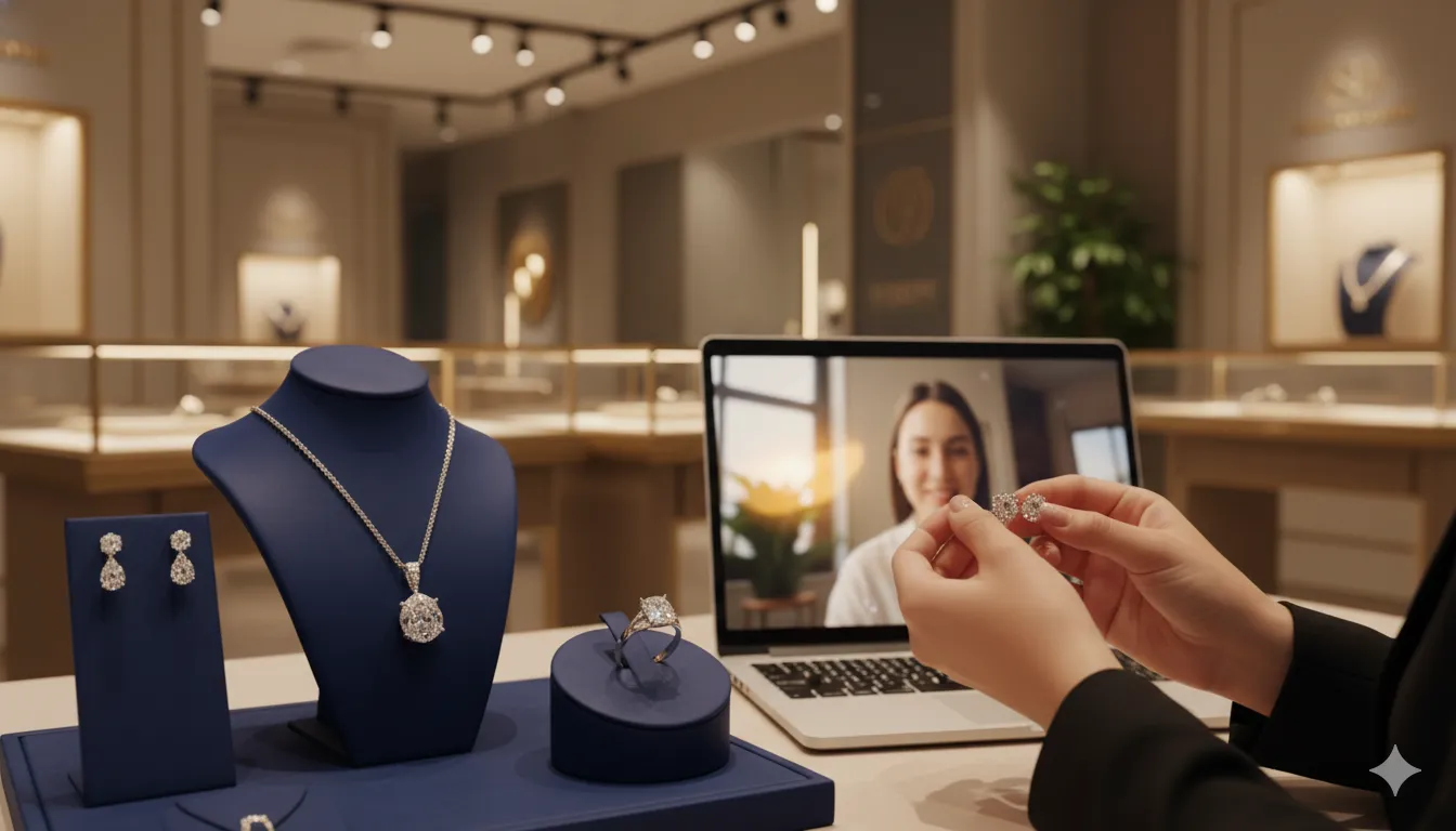
Put the demonstration one tap away. A live one-to-one video consultation with an advisor holding the piece is the digital equivalent of the three feet in front of the counter. It carries scale, finish in motion, weight through how the object is handled, and — crucially — genuine comparison between two pieces held in the same light at the same moment. It is also why we think video consultations are becoming a standard part of luxury retail: they do a job no page can.
Route to her advisor where the relationship exists. A demonstration from someone who knows what she already owns is a different conversation from one with a stranger reading a spec. The client book is where that knowledge lives, and it rarely makes it past the boutique door.
Capture what the advisors know about photography. Which pieces read differently in person, and in which direction. That list exists informally on every floor and is worth writing down — not for the website copy, but so whoever is on the call can raise it before she has to discover it.
Let the answer be discouraging. This one isn’t right for your wrist, wait for the spring delivery is the sentence that makes every other recommendation credible. It is also the sentence a product page structurally cannot say.
What to measure
Conversion on consulted sessions versus unconsulted, at comparable price bands.
Return rate on consulted orders against the house average. This should fall. A client who has seen the piece handled and discussed does not discover the weight on unboxing.
Return reasons that are perception rather than defect. If a piece accumulates “not as expected,” it is a candidate for proactive demonstration rather than for a photography review.
Share of high-value online orders attributable to a named advisor. Where this can’t be attributed, advisors deprioritise the digital channel, and the gap widens for organisational reasons rather than technical ones.
Report these against your own baseline. Industry averages say little about your house.
Where Immerss fits
Immerss is a live commerce platform that brings the counter online without touching the window. Three modules work together:
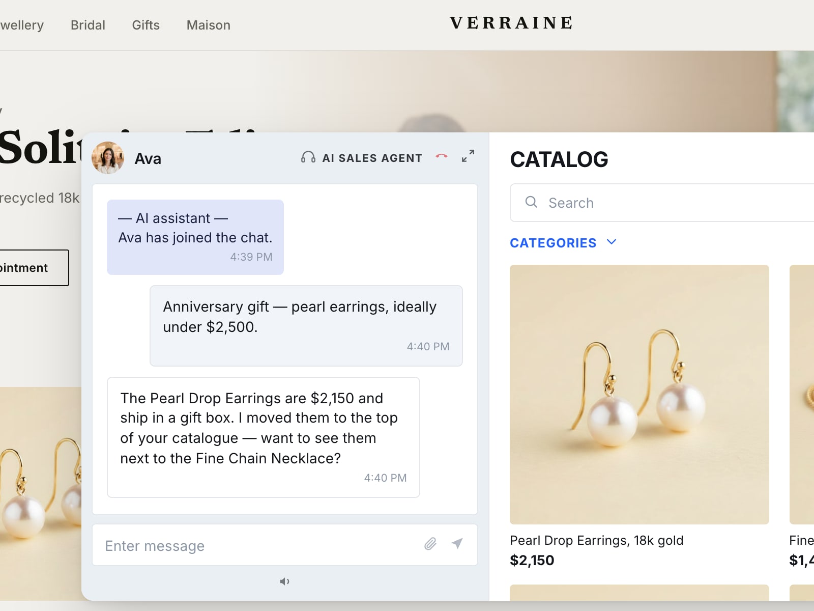
- AI Sales Agent — handles the specific, answerable questions on the site at any hour — availability, materials, sizing, delivery — and, when she needs to see the piece, hands the same conversation to an advisor mid-thread, with what she viewed and what is in her bag already in front of them. The handover is routed by your rules, so a house running a named-advisor model can send it to the client’s own advisor.
- Clienteling — Live Co-Shopping puts an advisor and a client in a one-to-one video session with the catalogue and checkout inside it, so the advisor can show the piece, compare it against the alternative in the same light, and place it in her basket during the call; Outbound handles appointments and ongoing client relationships.
- Video Commerce — Live Shopping Events, shoppable video and PDP video, for the moments a house wants to show a collection to many clients at once.
The demonstration stays human, it is personal because it starts from what she already owns and what she asked to see, and its effect is measurable at the order and advisor level.
The campaign stays exactly as it is. For a house, the entry point is a conversation and a 60-day pilot, on us, against your own catalogue.
In the shop, the window and the counter do different jobs and never interfere with one another.
Online, the house has the window. It is the counter that never made the transition.
Frequently asked questions
Generally not beside the campaign. Outside luxury, a plain, labelled daylight frame next to the styled image is cheap, honest and reduces returns. For a luxury house the campaign image is part of what the client is buying, and an unretouched frame beside it reads as a lapse rather than transparency, inviting a comparison the house loses by design. The verification the client needs is better placed in a live conversation with an advisor holding the piece.
In most retail, a product photograph illustrates the object so the shopper can decide about it. In luxury, the campaign image carries the house's visual language and the world it places the piece in, and a client choosing between two houses at a comparable price is choosing substantially between two visual propositions. The image is part of the product's meaning, so it cannot also be asked to do the plain evidential work a mass retailer's photography does.
Scale in her own reference frame, such as how a case reads on her wrist; finish in motion, such as how a polish catches light as a hand moves; weight, which decides many purchases at this level and cannot be photographed; the real difference between two pieces, whose images were shot separately and lit differently; and honest colour for the pieces the house knows photograph unlike themselves.
Put the demonstration one tap away from the product page: a live one-to-one video consultation with an advisor who holds the piece, compares it with the alternative in the same light, and can place it in the client's basket during the call. Route it to her own advisor where that relationship exists, and write down which pieces read differently in person so whoever is on the call can raise it first.